

Most contractor websites are judged in the time it takes a thumb to scroll once. The customer already knows what they need; they are checking whether you do it, whether you do it where they live, and how to reach you. If the first screen does not answer all three, they are back on Google.
Say the trade and the town in the first line
The headline is not the place for a slogan. "Fence installation in Fort Mill and Rock Hill" tells a customer and a search engine the same thing in six words. A headline like "Quality you can trust" tells neither of them anything. Put the trade first, the towns second, and let the rest of the page carry the personality.
If you serve a ring of towns, name the ring: Huntersville, Cornelius, Davidson and Mooresville read as one market to a Lake Norman customer, and naming all four on the first screen means each of them recognizes the page as theirs.
Put the call button where the thumb lands
Google reads the phone version of a site first when it decides where the site ranks (Google Search Central), so the phone screen is the one to design for. On a phone the bottom of the screen is where the thumb rests, so that is where the call button belongs, and it should stay there as the page scrolls. A phone number typed into a paragraph is a number to copy; a call button is a call. The seven sites on our website design page all carry a Call bar that follows the customer down the page.
The number itself should be the one someone answers. A tracking number is fine as long as it rings the same phone; a number that goes to a voicemail nobody checks is worse than no number at all.
Ask for the quote in one short form
A quote form with twelve fields is a form nobody fills in. Name, phone, the job and the town is enough to call someone back. Put the form one tap from the first screen, and make sure it lands in an inbox that is read the same day. The "$0 fuel charges" or "free estimate" line belongs beside it, not buried three screens down.

Show the proof before they ask for it
Your Google rating, how long you have been in business and whether you are insured are the three facts a homeowner checks before they call a stranger. Put them on the first screen, and make each one true and checkable: a rating with a link to the reviews, a founding year, an insurance line. A number nobody can check is a liability, and a made-up review is a lawsuit. Licenses are checkable too: North Carolina general contractors are licensed by the NC Licensing Board for General Contractors and South Carolina contractors by the SC Contractor’s Licensing Board, and both let a customer look a license up, so put the number where they can see it.
One photograph of your own work
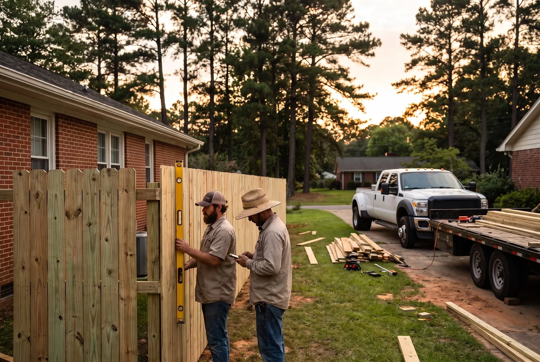
A stock photograph of a smiling crew in hardhats tells a customer you did not have a photo of your own. One real job, taken on a phone in daylight, beats it every time. If the photo shows a finished job in a town you serve, it does the work of a paragraph.
Where the rest of the page goes
Below the first screen: the services as short cards, the towns you serve, a few verbatim reviews, how the job goes from the first call to the last day, the questions people ask before they book, and one more way to reach you at the bottom. That is the whole page. A homeowner does not read a contractor site; they scan it for the four things above and call.
If you want to see what your own first screen could look like, we design it free before you commit to anything: the free design demo.